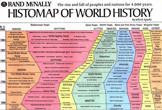
The first chart about the entire history of the world
The first grandiose chart of 4,000 years of world history was created by the author - amateur historian John B. Sparks and first published in 1931.
Called 'Histomap' , Mr. Sparks' massive and ambitious historical chart is done in a common way in books about real people, the real thing published in the 1920s and 1930s: the bar syllabus, in which large objects (world history, philosophical schools, all modern physics) are drawn into an easy-to-understand form for ordinary people, with elementary education Best.

Photo: datavis.ca
Each Histomap plate about 1.5 meters long was sold for 1 USD and folded in a blue cover with the testimonials of historians and critics. The advertised chart is: "clear, lively and meticulous" but still capable of "attracting viewers" by recreating: "the true picture of the progress of human civilization, from the ancient mud huts of the ancient people to the splendor of the medieval monarchy and ultimately the modern day of modern American life. "
The chart emphasizes dominance, using colors to show the power of different peoples (an almost ethnic understanding of the nature of groups of people, very popular at the time how was 1920-1930 evolved throughout history.
It is still unclear what the width of the color flow in the chart refers to. In other words, if the Y axis of the graph clearly shows the time, what does the X axis represent? Will Mr. Sparks see history as a constant total game, in which nations and nations will compete vigorously to share limited resources? Considering the time he created this chart - between the two world wars and the beginning of a major recession - this may be his thinking.
Mr. Sparks succeeded in Histomap by publishing at least two more charts: one on religion and one on evolution.
- Chimpanzees and orangutans also have a U-shaped happy chart
- 7 battleships once famous in the world chart
- Finding fossils has the ability to rewrite the entire history of people
- The most 'weird' bullets in world gun history
- 10 interesting facts about world history
- The Andes salt lake reflects the history of the Earth's climate and history
- History of the World Cup
- The history of the universe compressed for a year
- Human evolutionary history can be rewritten
- 10 most terrible computer disasters in history
- Did you know: Today is the world TV day
- Science warns: The Earth is falling into a catastrophe comparable to a nuclear bomb
 'Fine laughs' - Scary and painful torture in ancient times
 The sequence of numbers 142857 of the Egyptian pyramids is known as the strangest number in the world - Why?
 History of the iron
 What is alum?