All previous world maps were completely wrong, this is the correct map
In 1596, Dutch geographer Gerardus Mercator used an angular map projection to stretch the area of the Earth on a flat surface. Most of the maps we see today are based on this projection.
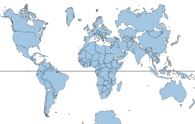
The map follows the Mercator projection.

Map with Niel Kaye's new measurements.
This projection, while keeping the right direction, but distorts the true size of some objects, especially those that are far away from the equator.
Neil Kaye, a UK climate data house recently created a visual map interspersed with Mercator projections that gives viewers a more accurate view of the true size correlations of some countries and countries. green.
According to the old Mercator projection, Russia and North America are much larger than Africa, but in fact, the continent is three times larger than North America and significantly larger than Russia.
Greenland was once considered a large area, even bigger than Africa, but it was 14 times smaller than the black continent.
Mercator projection shows that Scandinavian countries are larger than India while in fact this Asian country is three times larger than the total area of Scandinavia combined.
'Each country will be projected on the globe, then there will be some manual tweaks in countries close to the polar regions,' Kaye said, explaining that this is understandable when stretching a field. bridge on a flat surface.
In addition, many believe that unlike other geographers of the same period, Mercator did not travel much, but his geographic knowledge relied heavily on information obtained from the library.
- The oldest map in the world sells for 8.5 billion
- 16 posture to stand, sit, lie properly to avoid spinal disease
- Announcing the new map of Milky Way 187 million pixels
- How to see the Moon, Mars with Google Maps
- Strange story about traces of reincarnation (1)
- Global wind map
- The 5 'facts' you've ever learned in school turned out to be completely wrong
- How does Google Maps work?
- Why are all the current world maps wrong?
- Mysterious places on Google Maps
- The '5 correct' principle in drug use
- We don't understand anything about ourselves
 History of the iron
 The sequence of numbers 142857 of the Egyptian pyramids is known as the strangest number in the world - Why?
 'Fine laughs' - Scary and painful torture in ancient times
 Himba tribe has topless women in Africa