The surprising truth behind the Apple logo
In fact, the birth of the Apple logo and name is much simpler than the "plum gang" hypotheses suggest .
Apple is one of the highly recognizable brands, with an easily recognizable "bitten apple" logo .
Since its founding in 1976 by Steve Jobs, Steve Wozniak and Ronald Wayne, Apple has modified its logo a number of times. However, the biggest change happened only once after the company was founded.

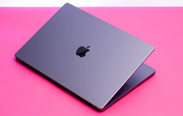
Apple logo on a MacBook. (Photo: The Verge).
Although simple and easy to see, the reason Apple leaders chose the "bitten apple" symbol is quite complex, from scientific philosophy, Steve Jobs' diet to theories of unknown origin. However, most of the stories about the Apple logo are inaccurate.
Apple's first logo
The apple appears in many historical anecdotes, including the "forbidden fruit " that Eve ate and shared with Adam in the Bible, to Isaac Newton's law of universal gravitation. However, Apple's first logo was not just an apple.
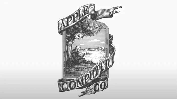
According to Android Authority, the Apple logo when it was first established depicted Newton sitting under a tree , an apple hanging on a branch . The words "Apple Computer Co." written on the cloth surrounding the frame.

Apple's first logo. (Photo: AppleInsider).
If you look closely, the logo's frame also has an excerpt from William Wordsworth's poem The Prelude : "Newton. a mind forever voyaging through strange seas of thought. Alone".
The logo's design looks outdated, even by 1970s standards. So it's not surprising that Apple quickly changed the logo.
Bite marks and 6 color bands
In 1977, Jobs hired designer Rob Janoff to draw a new logo for Apple. This version of the logo includes an apple symbol with a bite mark on it.
Unlike today's Apple logo, the first version of the apple logo had many colors divided into 6 horizontal stripes, the top blue meaning tree trunk.
Many theories suggest that the strip of color on the Apple logo symbolizes support for LGBTQ +, while the bite marks pay homage to Alan Turing - who is considered the father of modern computers. He was found dead from cyanide poisoning, with a bitten apple lying next to him.

Logo "bitten apple" with 6-color strip. (Photo: AppleInsider).
However, in a 2009 interview, Janoff denied the theory that the bite mark on the logo was related to Turing. Meanwhile, the 6 color bands actually represent the color screen of the Apple II computer.
The "bitten apple" logo with 6 colors was still used by Apple for the next 20 years, before Jobs returned and changed the logo to black in 1998.
Some other theories suggest that the Apple logo originates from Greek mythology, with the garden of the Hesperides or Hera's orchard being planted with apple trees that bear yellow fruit and bring immortality. However, no Apple representative has confirmed these "legends" .
Reasons for choosing the name Apple
Many theories state that the name Apple was chosen by Steve Jobs and Steve Wozniak to rank before Atari in the phone book. The real reason is much simpler, though.
Interviewed at a press conference in 1981, Jobs confirmed that he chose the company name Apple because he liked eating apples. At that time, Jobs followed a fruitarian diet, and chose the name Apple after visiting an apple farm.

Versions of the "bitten apple" logo. (Photo: AppleInsider).
"I love apples and love to eat them. However, the main idea behind Apple is to bring simplicity to the masses in the most sophisticated way, that's all ," Jobs said.
With the bite mark on the logo, Janoff explains that detail to distinguish it as an apple and not another fruit.
He also pointed out the coincidence that the word "bite" ("bite" in English) sounds similar to the computer "byte" . The hole in the logo also fits the letter "a" in "apple" when the brand name appears with the symbol for a short time.
- Most identify wrong Apple logo. Why?
- Why is the logo of famous brands on the left chest?
- The truth about 'Newton's apple tree' 400 years ago
- The true meaning lies behind famous logos
- Learn about the shield logo of Portugal
- The world's first yellow fleshed apple apple
- Close up of the magnificent 'spacecraft' of Apple's 1-0-2
- Turns out, Tesla's T
- VINASA announces the preeminent software ranking icon
- History 'evolution' of the Google logo
- What is special about the Apple New Year in Vietnam and other Asian countries?
- Ancient apple trees spread out with 10 football fields
 What is the Snapdragon SiP chip?
 How to create a yellow circle around the mouse cursor on Windows
 Edit the Boot.ini file in Windows XP
 3 ways to restart the remote computer via the Internet