Only knowledgeable people realize the mysterious message in 7 famous logos in the world
Few people, logos of famous brands in the world are intended to convey a message. However, not everyone is observant enough to recognize them.
Regardless of which brand always has its own brand identity, it makes it really different from the rest of the world - of course it is the case of a good brand identity. .

In a brand identity, it can be said that logos are the most important factor.
In a brand identity, it can be said that the logo is the most important factor, because it indicates what business we are seeing at first sight.
And of course, owning a logo is not difficult, but to have a unique, strange and meaningful logo is not a simple thing. It is a huge investment in brainpower and effort, such as the case of famous brands below.
1. Pinterest

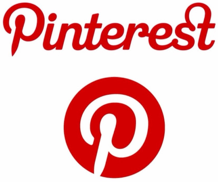
The letter P in the name of the brand is also stylized.
In recent years, Pinterest has really become popular. This social networking site specializing in storing and sharing ideas, videos, images . is used by many people.
However, few people noticed that the brand's logo had an impressive feature: the stylized P-shaped became "pin" - ie "pin" in English. Even the letter P in the name of the brand is stylized as such.
According to Michael Deal, who oversees Pinterest's design: "I always try to avoid using anything too direct to show a pin-shaped image, because it's too boring. And the P itself is an expression. Very good picture of pins already ".
2. Toyota

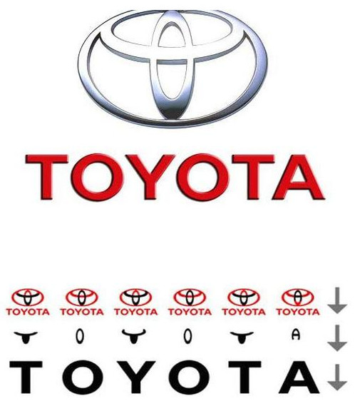
If you separate each part of the logo, you will see the words Toyota appear.
The famous Japanese car company owns a relatively confusing logo, with 3 overlapping oval shapes. According to the brand designer, this logo represents the unity of the hearts of customers, businesses and products.
However, that is only part of the mystery behind this brand. Another mysterious message he shared, that is to take each part of the logo, we will see the words Toyota appear.
3. Wendy's
For those who do not know, Wendy's is the famous fast food brand of the US, with a turnover of billions of dollars each year.

This is a famous American fast food brand.
At the beginning, Dave Thomas - Wendy's founder of the restaurant chain - said the logo aims to show the restaurant's warmth, similar to family meals.
It sounds really unrelated, but actually the logo has done this very well. Keep an eye on Wendy's collar, it forms the word "Mom" - mother's beloved name in English.
This is not something that can be realized at first sight. But when it comes to it, customers will associate their image with the brand - that's the purpose of Dave Thomas.
4. Formula 1 racing

On closer inspection, you will see the space between the letter F and the red lines is 1.
The most famous racing car in the world has an extremely impressive logo: the letter F - short for Formula (Formula) and red lines symbolizing energy, speed and passion.
But where did the number 1 go? On closer inspection, you will see the space between the letter F and the red lines is 1.
5. Baskin-Robbins

Number 31 is the 31 symbol of the store's first ice cream.
As one of the most famous ice cream firms in the world, Baskin-Robbin also possesses a hidden logo that contains the mysterious message behind it.
Besides eye-catching colors, extremely suitable for young people, letters B and R also make up the number 31 anymore.
Carol Austin, Vice Marketing Director of Baskin-Robbins shared that No. 31 represents the store's first 31 ice creams. In addition, the company's intention is to imply that customers will have the opportunity to feel completely new flavors every day of the month.
6. Tostitos

Tostitos is the famous brand of Mexican bim / chips.
Many people may not know Tostitos, but this is an extremely popular brand of potato chips / bimbo in North America, with Mexican flavored sauce.
The logo of Tostitos at first glance is just the brand name highlighted on the green background. But the two middle T's are actually two people dipping chips into a bowl of sauce that is represented by the letter I. Impressive?
7. Coca-Cola


In addition to the messages that came out, coincidentally, the "O" on the logo was similar to the Danish flag.
Among the brands mentioned here, Coca-Cola is probably the luckiest. Simply because besides the messages that came out, it was a coincidence that the "O" on the logo was similar to the Danish flag.
Again, this is not the original intention of the world's largest beverage company. And from what I have to say, Coca-Cola immediately made a huge media campaign in Denmark after noticing this accidental "leaf bud" .
- Logo meaning of world famous car companies
- The true meaning lies behind famous logos
- Discover logos of famous studios
- 50 logos of famous brands that day and now
- Compose a lie message that takes more time
- The final message of Hawking's physical genius sent to mankind
- Why is Yahoo purple, Google seven colors and Facebook is blue?
- The most mysterious place on the planet
- Tattoo message message
- The hot sun caused a forest fire to reveal a mysterious message from World War II
- Summary of 'hot' news on April 2
- Message mystery is hidden in famous ancient paintings
 'Fine laughs' - Scary and painful torture in ancient times
 The sequence of numbers 142857 of the Egyptian pyramids is known as the strangest number in the world - Why?
 History of the iron
 What is alum?
 The 'secret' behind the drug name Viagra
  Unique story behind animal logos
  Opening ceremony of the 5th brand marine forum
  Google and Gmail 'bogged down' in Europe